Michael Grossman User Experience Case Studies
The case studies below show a range of projects including a mobile app, global trading application replatforming and the design of a suite of wealth management web applications. Each will show:
- My role on the project
- What UX output I delivered
- The value the UX project had on the firm
Case Study #1: Wealth Management Client Mobile App
Project: Deliver the firm’s first mobile app for wealth management clients.
My Role: I headed the project and interacted with senior business owners, wealth management clients, financial advisors, vendors, development and QA.
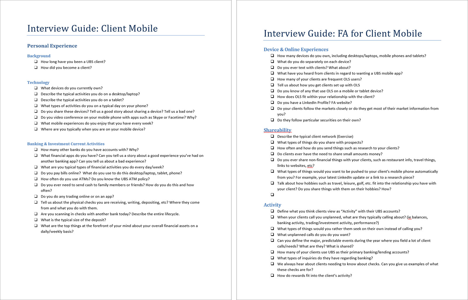
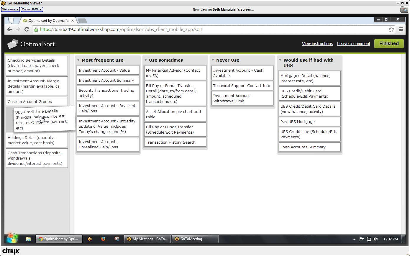
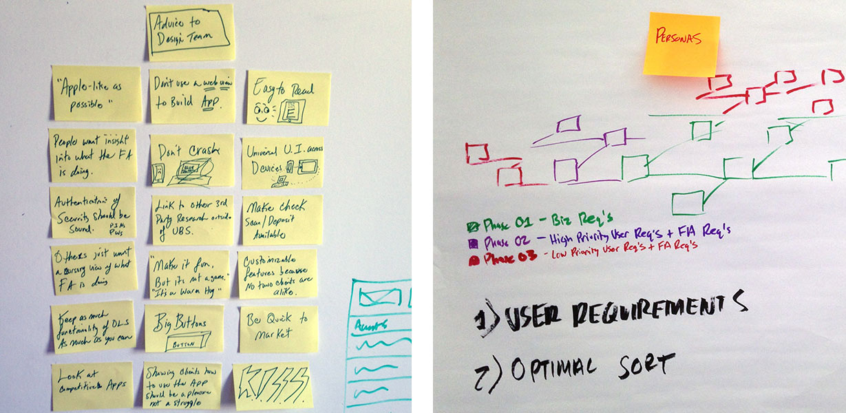
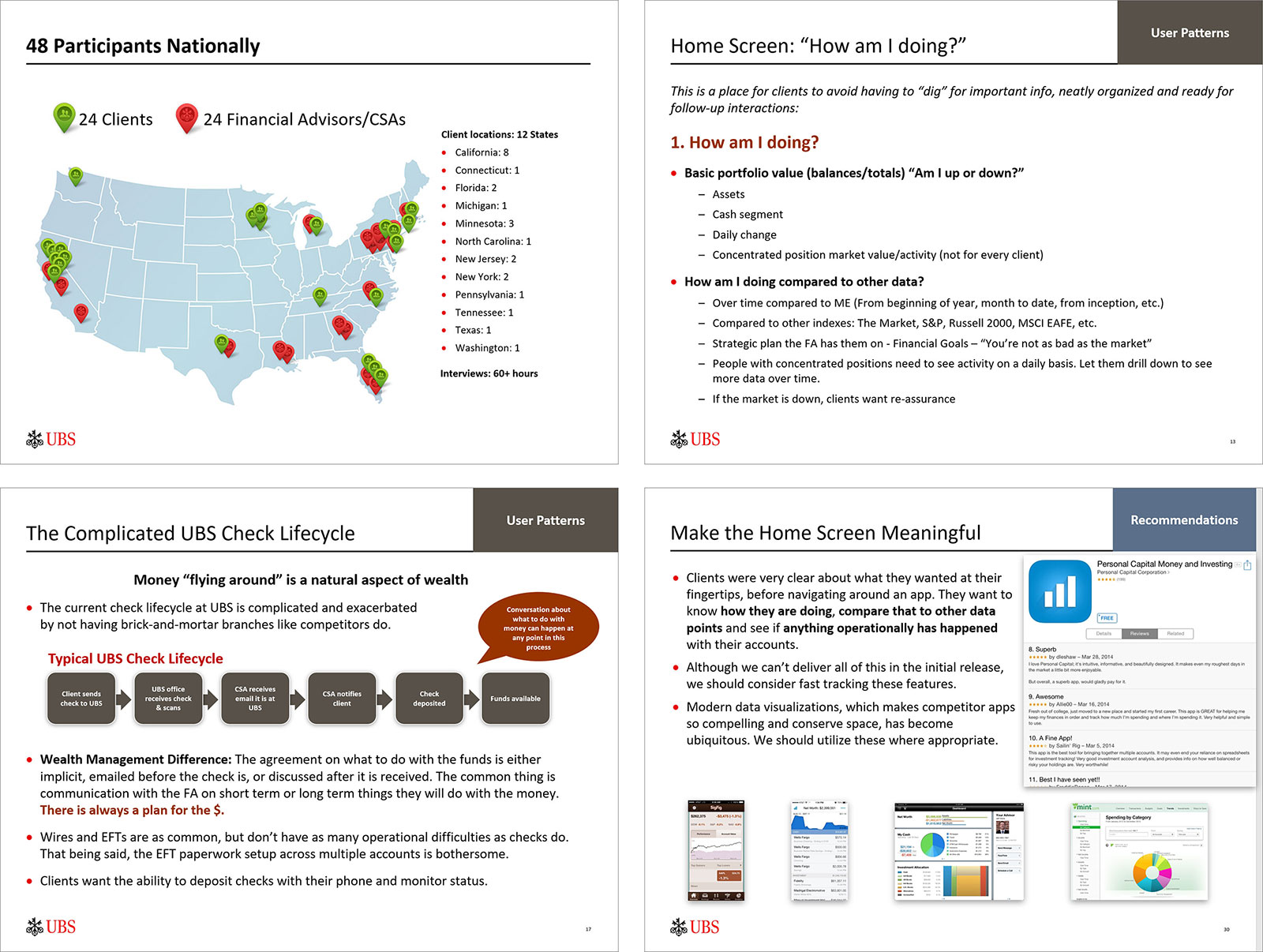
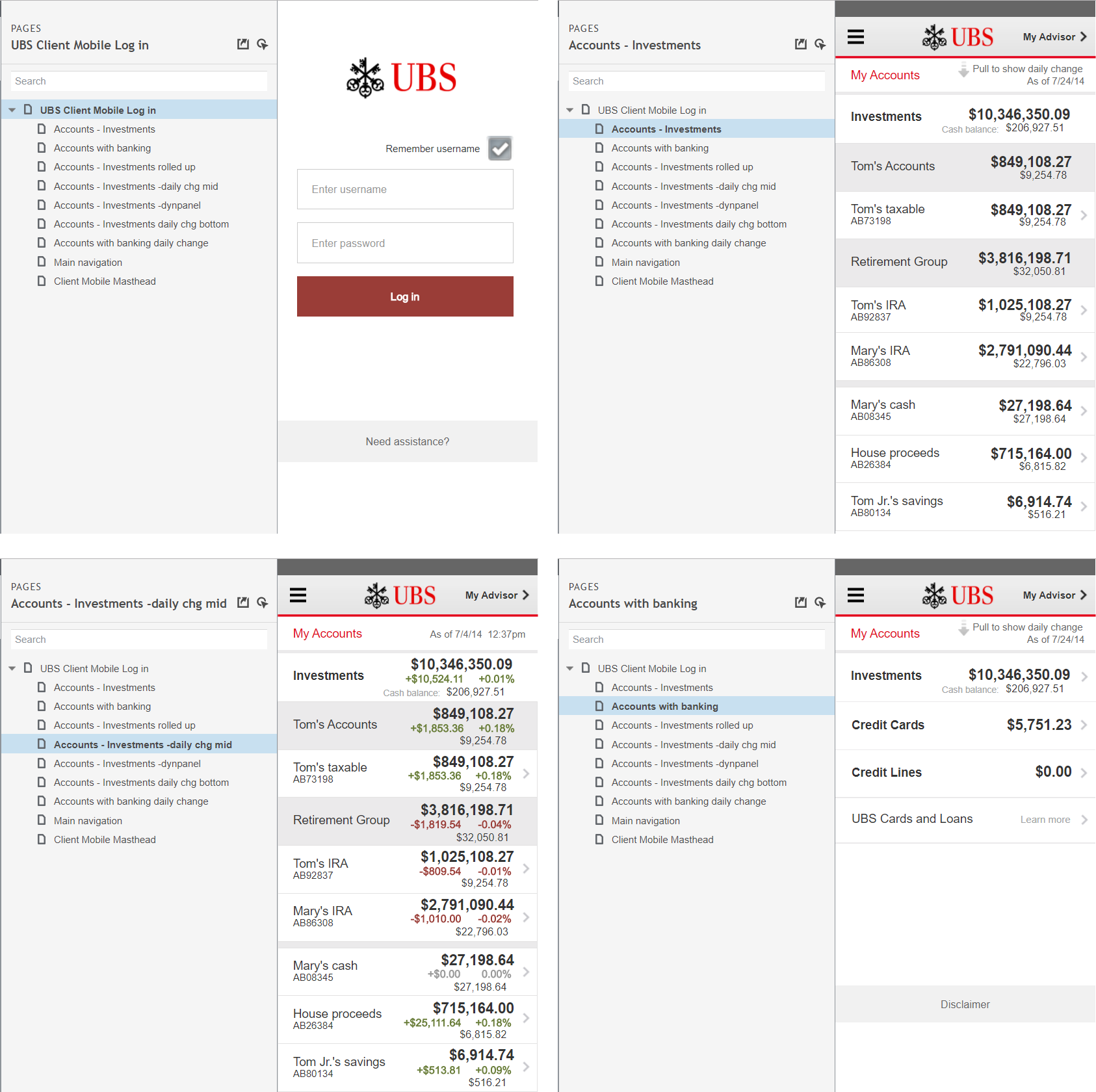
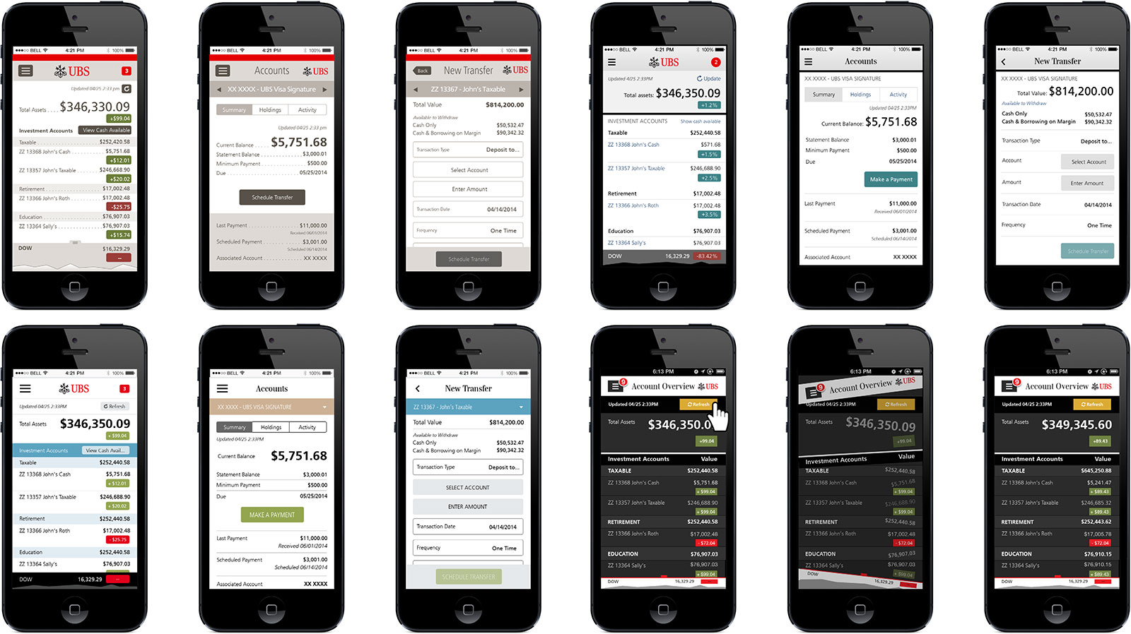
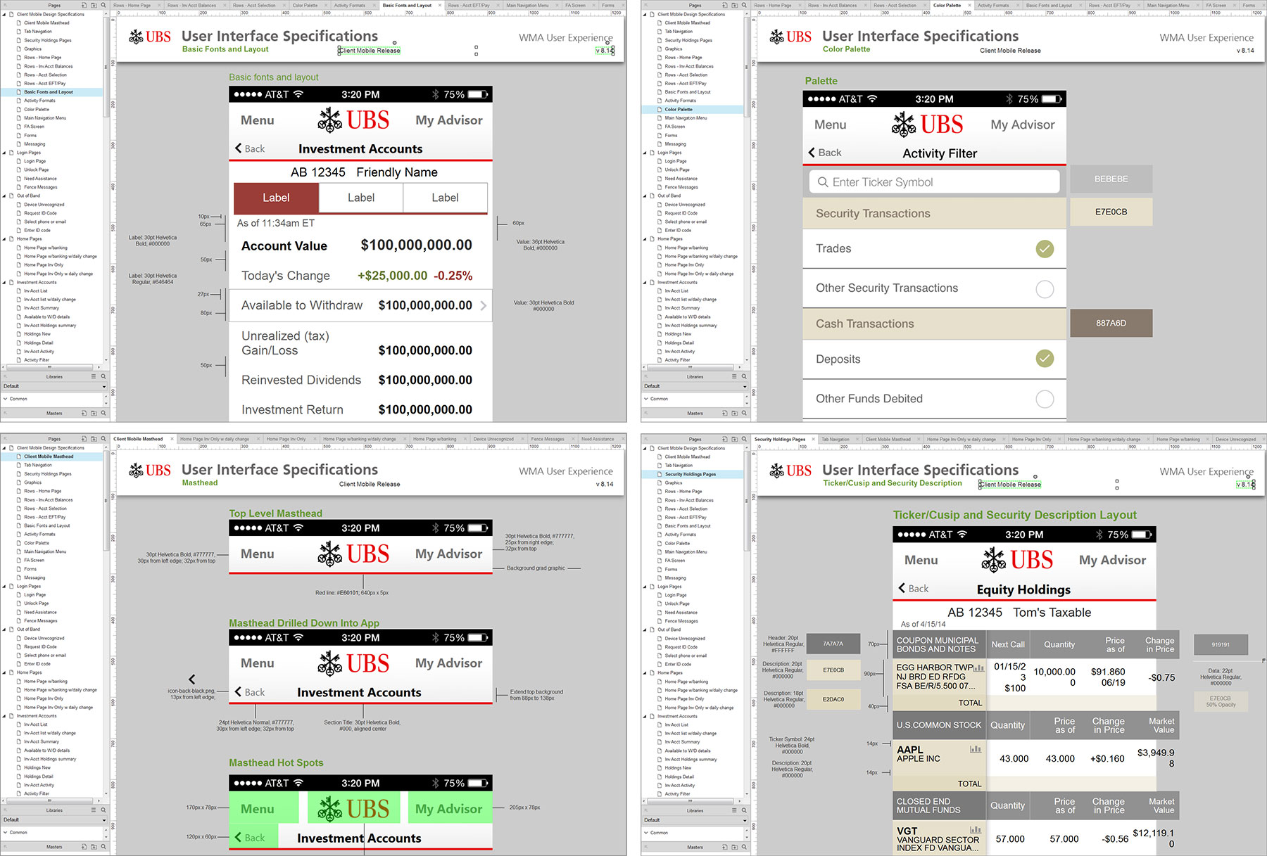
UX Deliverables: User Research: Interview guides, online card sorting, wireframes, stakeholder interviews, final Listening Channel Report. Visual Design: Multiple iterations approved by business and select clients. User Interface Specifications: Annotated high fidelity screens in Axure and shared via HTML.
Value: This initial mobile app by the firm was delivered on time and within budget, with rich insights that could be leveraged for future releases
User Research Materials, Synthesized Findings and Recommendations
Wireframes
Visual Design Options
Final UI Specifications
Case Study #2: Global Foreign Exchange Front-End Replatforming
Project: Replatform both the front end of the world’s largest electronic foreign exchange broking platform with average daily trading volumes of $220b
My Role: Lead the UX stream by conducting global user research that would guide the redesign of an application with a highly change-averse user base. I worked with Portigal Consulting to help supplement the researchers and I facilitated every global interview across five countries.
UX Deliverables: I developed the approach to this large-scale UX project, created the interview guides, conducted stakeholder interviews, developed prototypes, and synthesized the findings into a large final research report that was presented to the CEO.
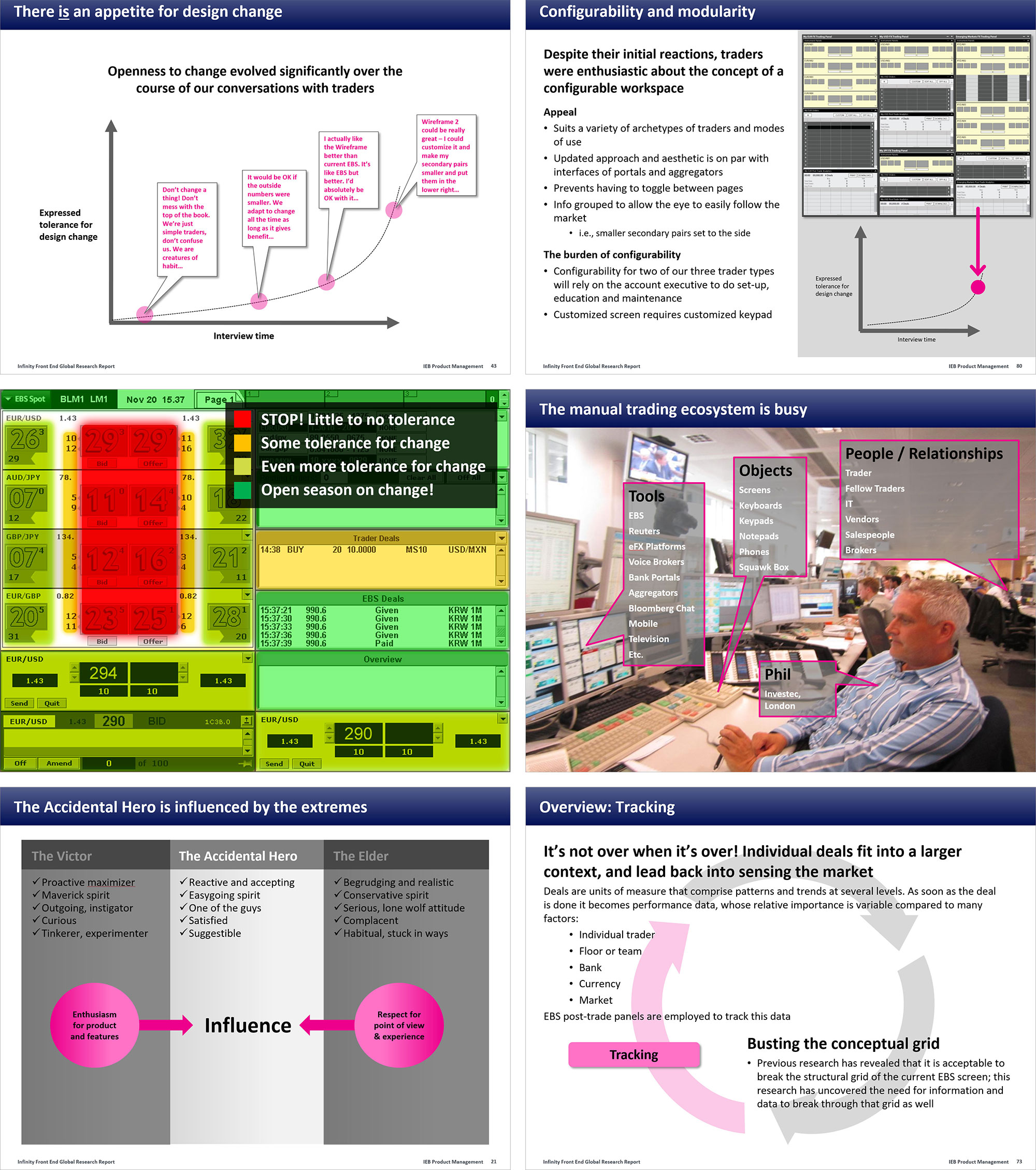
Value: This project provided the company the insight it needed to implement the biggest design changes in over twenty years.
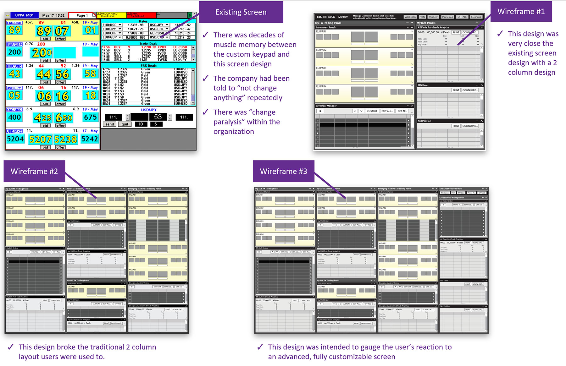
User Research Materials - Interview Guide & Wireframes
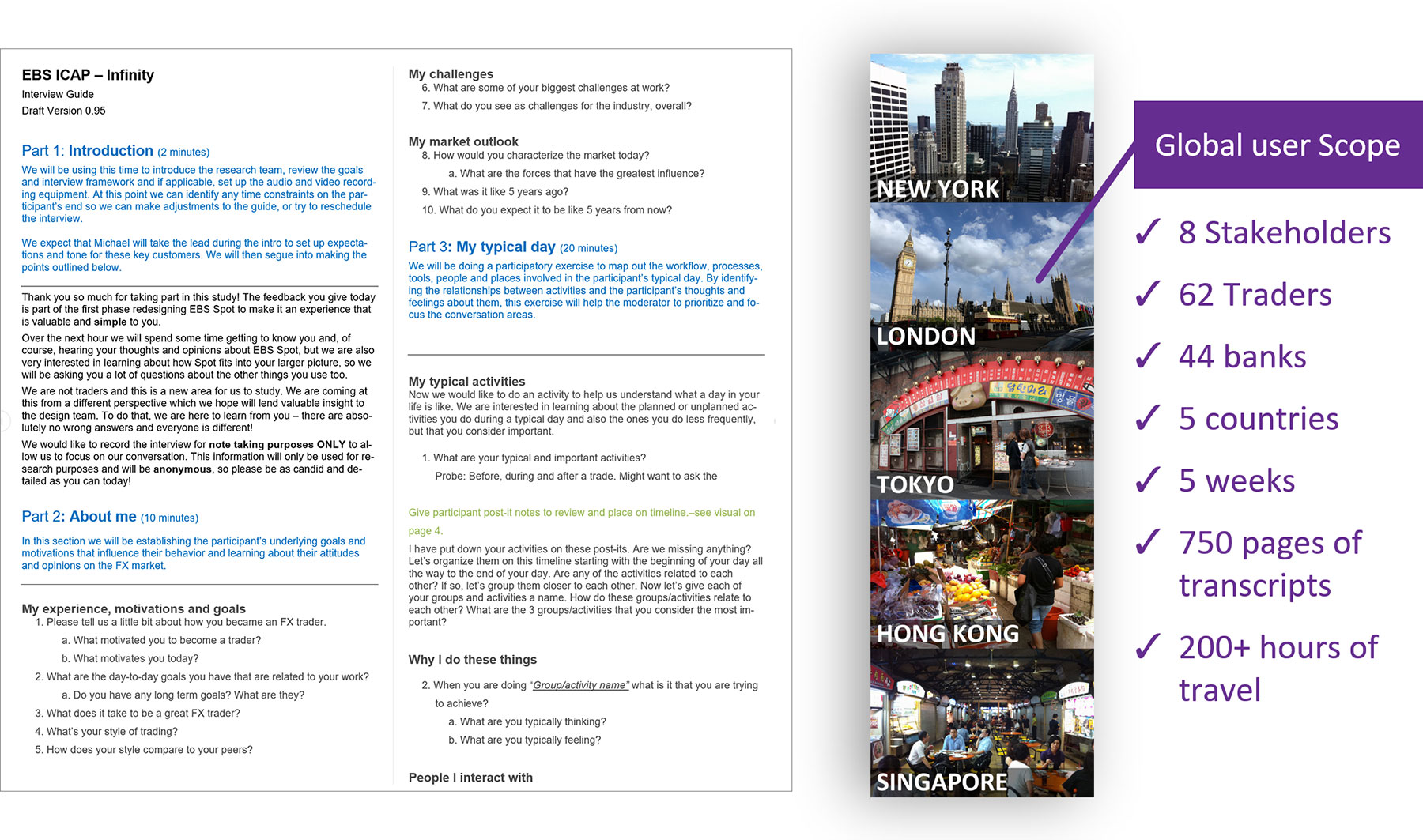
User Research Report - Select slides
Overall Project Conclusion
Research findings allowed the company to move from a screen that rarely changed to a new, flexible screen to compete in today’s FX environment (which is eerily similar to my original research wireframes).

Case Study #3: Wealth Management Framework Application Suite Design
Project: Develop powerful, yet simple-to-use web applications for financial advisors to do things such as view overall client status on one screen, rapidly create proposals and change their risk profile. This was a multi-year project that was developed in an agile environment, which was new for the bank. b
My role: I was the lead on this project where I worked closely with senior business partners, users in the field and developers. There was a single project but it consisted of many projects.
UX Deliverables I was responsible for:
- User Research: Interview guides, stakeholder interviews, low to high fidelity prototypes, final research report.
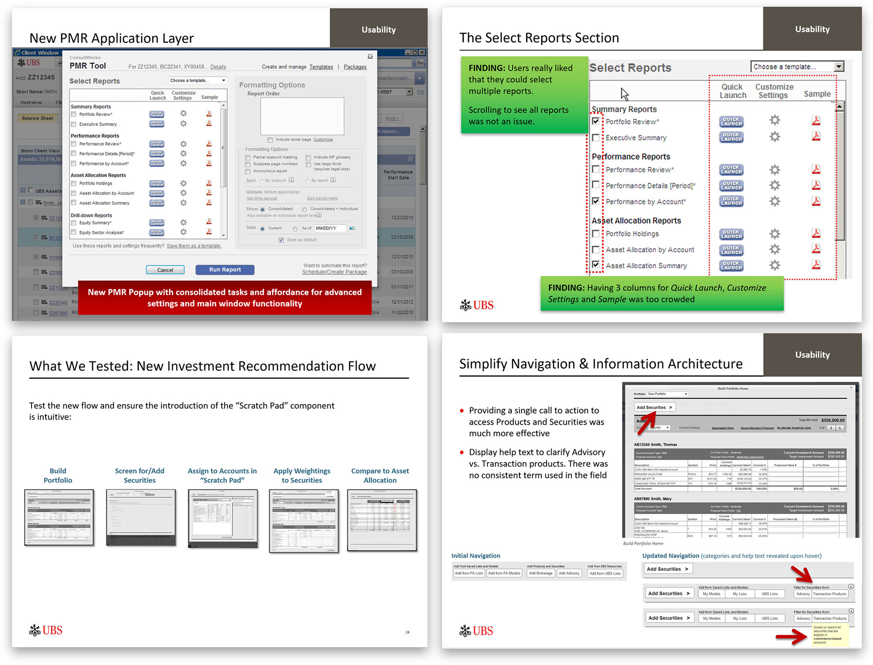
- Usability Testing: Designs were tested in a number of ways, including in-person in the field and remotely.
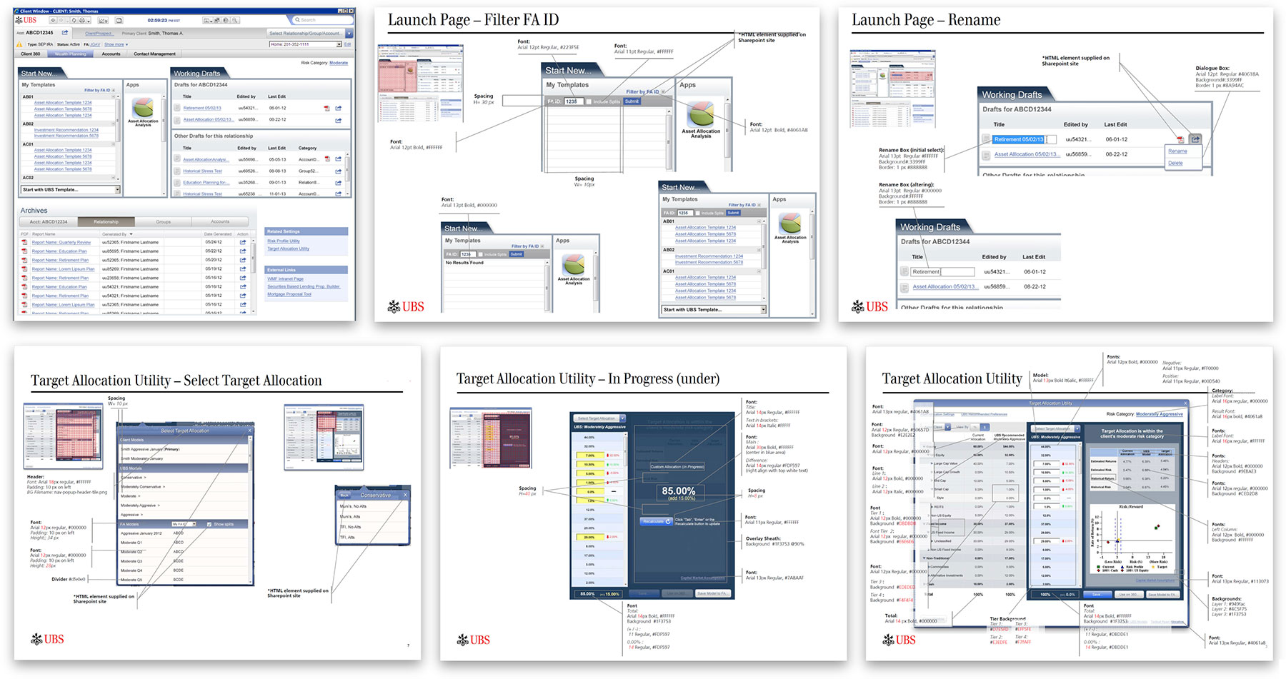
- Visual Design: The design had to look modern yet adhere to an antiquated style guidelines.
- UI Specifications: The final design specifications were delivered online via annotated Axure screens
Value: This saved the users many steps and time, new features they had been asking for, as well as gave them new tools to deliver a better experience to their clients.
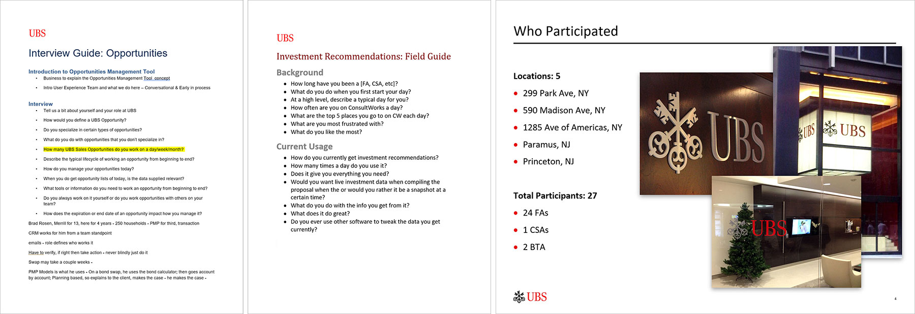
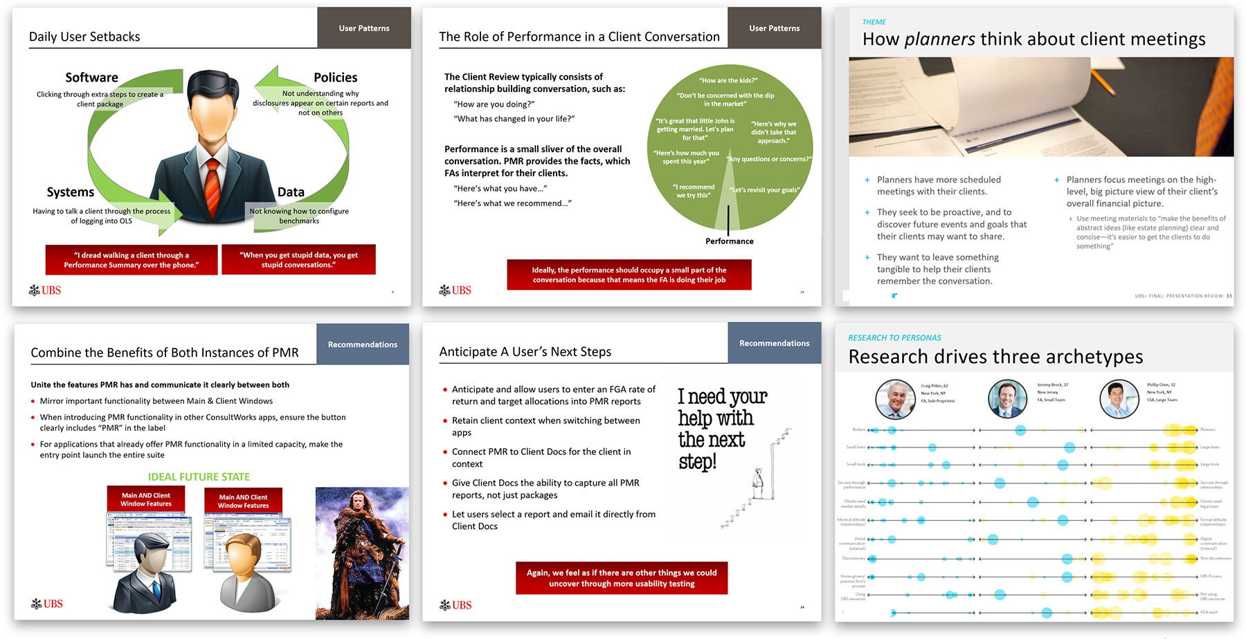
User Research Materials & Report Samples
Usability Testing
Final Visual Design and UI Specifications
Have any questions? Give me a call. I love talking about UX.

